 Overall, I am happy with the final outcome of my poster. Since adding the billing block, the certification and the 'Coming Soon,' it feels like a realistic teaser poster. There is a balanced feel of images and text, and the colors although majority are blacks and grays, there is also subtle amounts of bright color, coming from the background in the title, the house, the masked man, and even the certification. It also gives an idea of the genre and also a rough idea as to what is too come in the film.
Showing posts with label Poster planning. Show all posts
Showing posts with label Poster planning. Show all posts
Wednesday, 6 April 2011
Final Poster
Overall, I am happy with the final outcome of my poster. Since adding the billing block, the certification and the 'Coming Soon,' it feels like a realistic teaser poster. There is a balanced feel of images and text, and the colors although majority are blacks and grays, there is also subtle amounts of bright color, coming from the background in the title, the house, the masked man, and even the certification. It also gives an idea of the genre and also a rough idea as to what is too come in the film. 
Wednesday, 2 February 2011
First Drafts for Film Poster


Another idea i used for my trailer, was an idea similar to the film poster 'Let the Right One In.'
Too get this effect, I started with the original photograph and played around with the shadows, the brightness and also the contrast. Then i went on to use different filters and effects. Then finally, I tested different Colours.

To develop this, I used the crop tool, to remove the face in the glass.
Monday, 24 January 2011
First Drafts for Film Poster


I have used a grab taken from the footage of my actual trailer. I started by using the clone tool, and removing the car in the drive in the right hand corner, i then tried out many different filters and the filter used currently is 'Watercolour.' I also then zoomed in, and have been playing around with different effects and titles, by adding and playing around with different layers.

Wednesday, 15 December 2010
Let the right one in
 The blurry, scratched and faded background, is an idea that i liked, the distorted effect is something i am planning too try out. Also the idea of the shadow of the main character too make one of the letters up, is also an idea i will try out. This fits with the genre and atmosphere of my film. Both this poster and the poster below, play with the idea of the unknown and what you can't see, which again is very similar to the atmosphere of my film/trailer.
This is similar to one of my ideas, in the way that you can see the silhouette or the shadow, of the main girl to one side, however my idea develops in that you can see a shadow or silhouette of a man standing way behind her. I like the hand print on the sheet of glass, and the slight tint of red on parts of the glass- suggesting blood, the girl is standing in a way that implies that she is helpless, desperate and scared. All of these features together show clearly that this is a Horror, however without saying it outright.
However, the actual title is not that clear which in a film poster is quite a vital thing, if the title is clear that it is hard for it to be that memorable because of the fact that there are so many around.
Wolfman Film Poster
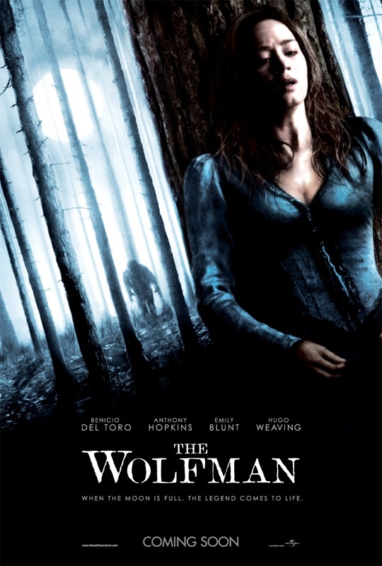
Again, i like the idea of seeing what she can't see. Despite the fact that this film has a supernatural theme, the forest and her persona gives the idea that she is obviously scared and alone (given the forest is empty) which is the same as the main character in my trailer. The figure moving towards her where she's hiding is good as again it plays with the idea of the unknown.
Final Destination Film Poster


This poster, obviously shows that this is a thriller/ horror, although it is not exactly clear what will be involved in the film , however it seems some what obvious what we should expect. This is a similar theme i am going for in the film poster also.
I liked the smashed glass effect, which splits up the face, so you cannot exactly see what you are looking at, an idea i had was to develop this by having a face in the top left hand corner looking down on her.
Sunday, 12 December 2010
The Road Film Poster

This film poster gives no clue as too what will happen in the film, gives an idea of what genre we are expecting because of the colors and the fact that the whole scene is derelict and the atmosphere, which is tense.
I like the completely still and spooky effect you get from this, which is mostly from the colors and the emptiness.
Friday, 10 December 2010
Hide and Seek

This film poster rather than a lot of the other film posters i have looked at, it is not paying with the unknown. A simple but effective shot of the girl looking out the window. The thrill from this poster mostly comes from the tag line 'you can run but you can't hide.' The font is also something that works, I like the way in which it looks like a child has drawn this. Also, this is much more bold and stands out a lot in comparison to the title, which is in a simple white. Although, my focus will be on the images and the title, rather than the tag line.
Subscribe to:
Posts (Atom)