Wednesday, 9 March 2011

Evaluation Trailer 4: How did you use media technologies in the construction and research and evaluation stages?


As well as developing my skills on final cut, I also used many other technologies too help me throughout my construction stages; mainly I have used the internet, to find and record the majority of my research.

Other media technologies I used to help formulate my ideas:

YouTube, this I used a lot in the beginning to help with my research, simply searching different trailers to help me with my ideas. I also used it to upload all my videos, including my recce, storyboard animation and my practice of my fonts using the effect ‘Light Ray’s.’ Finally, to help me with my ident, I used a flash tutorial of YouTube. For my evaluation I also learnt how to tag my own YouTube uploads.

Throughout my whole course, I have posted all my work on Blogger, posting all my work and also embedding links, Prezi images and different You Tube video. As well as using my own blogger, I also used other blogs to help with my creativity, especially using ‘Get ahead OCR.’


Thursday, 3 February 2011

Paranormal Activity Website


The lay out of this website is an effect I would like to give off in my website. Everything about the poster tells me about what genre it is, the colors uses, and all the pictures and links. This is an effect that I would like to show within my website as I think it is vital for the audience to understand what they are watching.

Poster Development

I originally started with this image which i too, this was an idea i used from the poster, 'Let the Right One In.' I like the hand print and being able too see the faint outline of the face. However when looking at it in terms of my poster, it needed too be darker, and give a greater understanding as to what happens in the film, and also what genre it is. I wanted a distorted effect for my poster, and the background of this photograph helped me too give this effect. Therefore all the layers, apart from the text, were placed behind the original image. With all images added, i edited 'Opacity' effect and also 'fill.'

I then added the effect, 'watercolor' and i played around with lowering the shadows and the different colors, finally coming with the outcome of this. However as one of the unique selling points of the trailer is its location, I thought it was vital that e get an idea of that in the poster. The effect watercolor and the background of the original image blended together, gave the distorted effect that i was hoping for.

As i filmed in HD, i was able too use grabs from my footage too use in my poster, i simply saved the clip as a still image and saved it a photoshop file, and then added it as an extra layer. I did this with the still of the house in the top left, and also for the mask shot.


The house grab, I enhanced the coloring, especially for the drive way and the green lawn. I decided too keep the ray of sunshine from the top right, which in the final poster, the brightness of the hand, gives the effect that the sunshine is shinging onto the hand. The grab of the mask, I cut out in photoshop and then added effects and edited the coloring.

I finally added, the lettering, however i decided that there was too bigger difference, from the busyness of the top of the trailer, in comparison to the blackout space at the bottom. although, i have not added my billing block, tag line and certification, I still felt that there is a chance that the poster would not be a memorable one.

Wednesday, 2 February 2011

First Drafts for Film Poster


Another idea i used for my trailer, was an idea similar to the film poster 'Let the Right One In.'
Too get this effect, I started with the original photograph and played around with the shadows, the brightness and also the contrast. Then i went on to use different filters and effects. Then finally, I tested different Colours.


To develop this, I used the crop tool, to remove the face in the glass.


Monday, 24 January 2011

First Drafts for Film Poster


I have used a grab taken from the footage of my actual trailer. I started by using the clone tool, and removing the car in the drive in the right hand corner, i then tried out many different filters and the filter used currently is 'Watercolour.' I also then zoomed in, and have been playing around with different effects and titles, by adding and playing around with different layers.


Wednesday, 15 December 2010

Let the right one in

The blurry, scratched and faded background, is an idea that i liked, the distorted effect is something i am planning too try out. Also the idea of the shadow of the main character too make one of the letters up, is also an idea i will try out. This fits with the genre and atmosphere of my film. Both this poster and the poster below, play with the idea of the unknown and what you can't see, which again is very similar to the atmosphere of my film/trailer.


This is similar to one of my ideas, in the way that you can see the silhouette or the shadow, of the main girl to one side, however my idea develops in that you can see a shadow or silhouette of a man standing way behind her. I like the hand print on the sheet of glass, and the slight tint of red on parts of the glass- suggesting blood, the girl is standing in a way that implies that she is helpless, desperate and scared. All of these features together show clearly that this is a Horror, however without saying it outright.
However, the actual title is not that clear which in a film poster is quite a vital thing, if the title is clear that it is hard for it to be that memorable because of the fact that there are so many around.

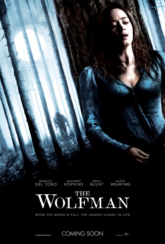
Wolfman Film Poster


Again, i like the idea of seeing what she can't see. Despite the fact that this film has a supernatural theme, the forest and her persona gives the idea that she is obviously scared and alone (given the forest is empty) which is the same as the main character in my trailer. The figure moving towards her where she's hiding is good as again it plays with the idea of the unknown.